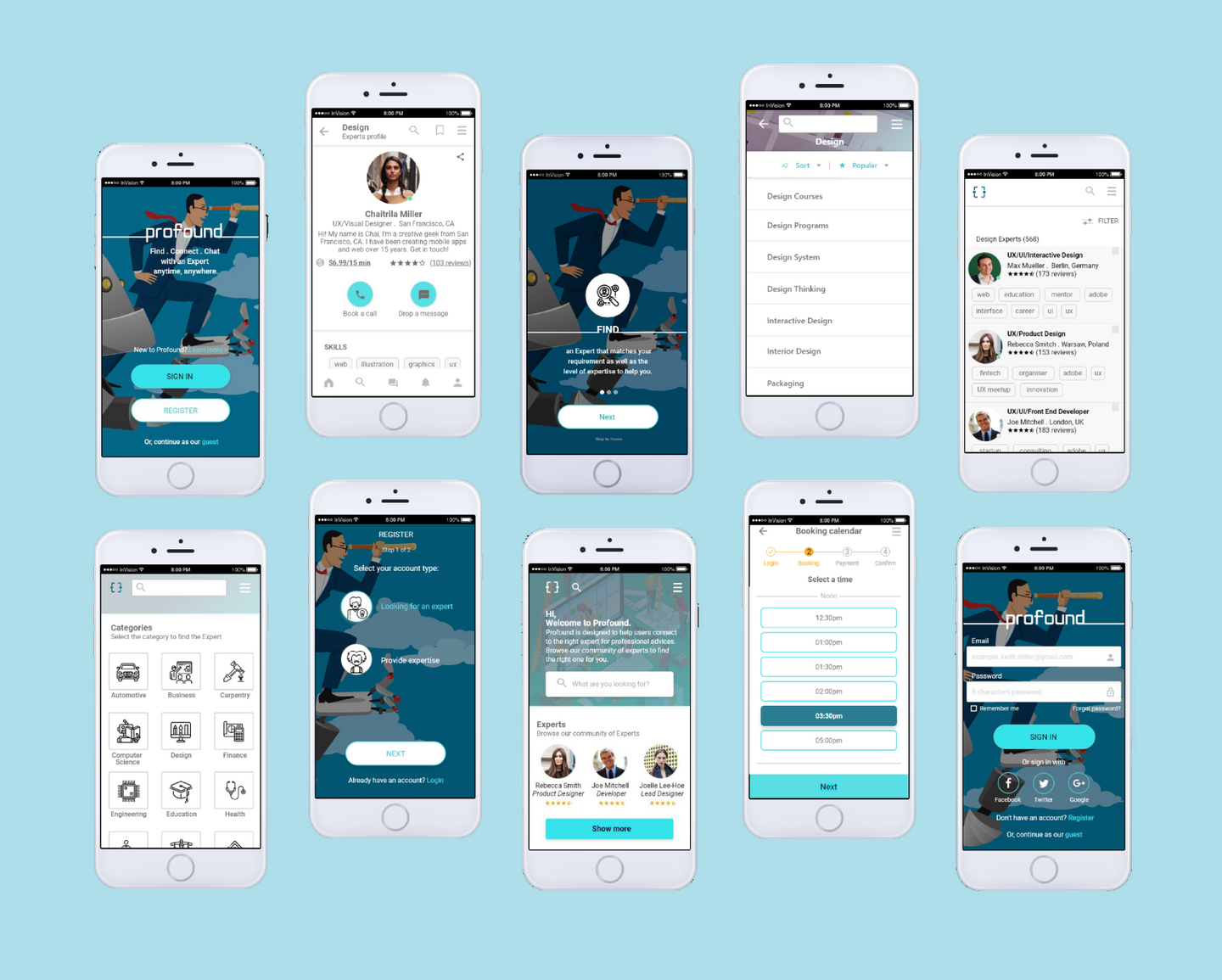
ProFound is an expert app that provide users with expertise advice in nearly any field. Whether it is an interior design solution or a technical question for a professional mechanic, users can feel more informed and more prepared to face their everyday (and not-so-everyday) problems.
01
PROBLEM STATEMENT
Users would like to be informed or when encountered a problem, to be able to reach out to an expert for help. By having access to expertise services, users can find, connect and interact with the experts in a meticulous way.
02
HYPOTHESIS
By providing a platform that has,
- broad expertise services
- level of expertise
- informed availability of experts
- rating of experts
- help for every budget
- quick response
- easy steps to make a call booking,we will help users to find the expert list that matches best to their requirement. As a result, users will know the profile and contribution of the experts to decide who to reach out to to schedule a short video session over the platform.
03
USER CENTRED DESIGN
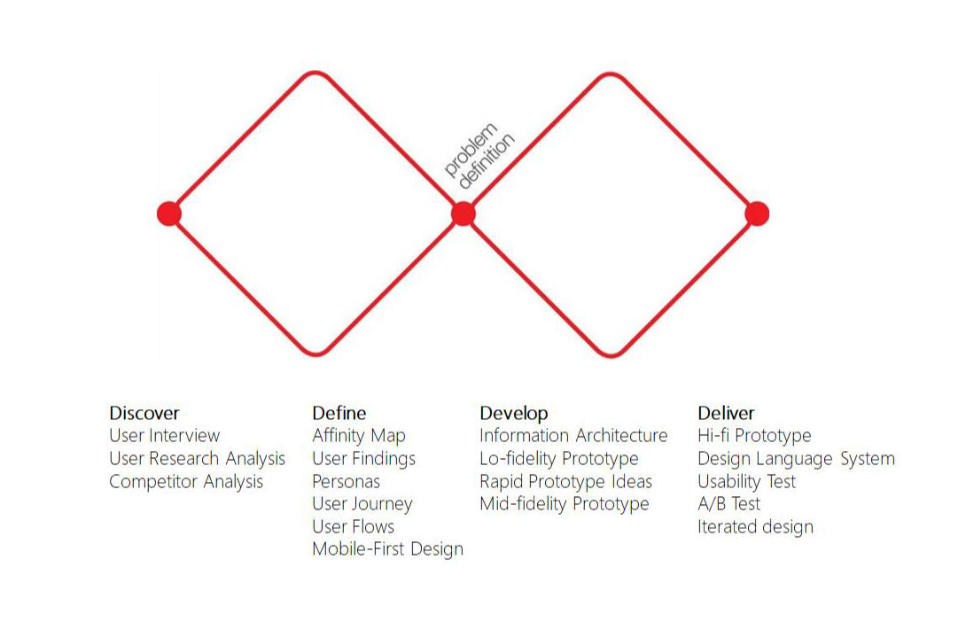
The double diamond diagram is used as the design process to explore the problem and solution space with keeping the users at the heart of the process. This means that ideas are developed, tested and refined a number of times, with weak ideas dropped in the process. Solutions or concepts are prototyped, tested and iterated. This process of trial and error helps designers to improve and refine their ideas until they are finalised, produced and launched.
04
USER RESEARCH
The research method I have chosen to collect information is through User Interviews to understand the users’ requirements in the context in which they might use a product or service.
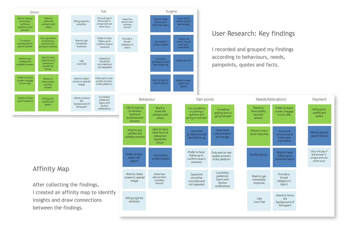
Interviews were held to attain the following goals:
- Identify platforms users use to connect to experts for advice
- type of advice users look for
- how often they contact to an expert
- Tools used to contact the expert, the experience and expectations
Insights based on affinity mapping- People will generally look for free help on the internet before considering a paid service.
- People expect the answers to be of quality and is verified. Similar to the background of the expert.
- Users should get quick response and follow up if the help will be delayed.
- Users should not need to repeat the questions if the calls will be transferred to other experts.
- Users would like to have screen sharing feature, possibility to upload image of the issues.
- There is a need to include various communication options to contact the expert.
- Users would like to have the option to share answers with others or connect to the community.
- People will only pay if the service is fast and of good quality.
05
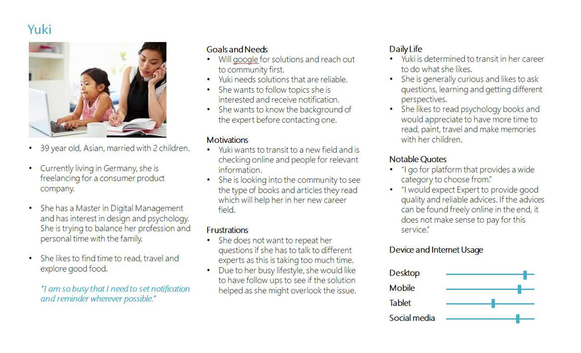
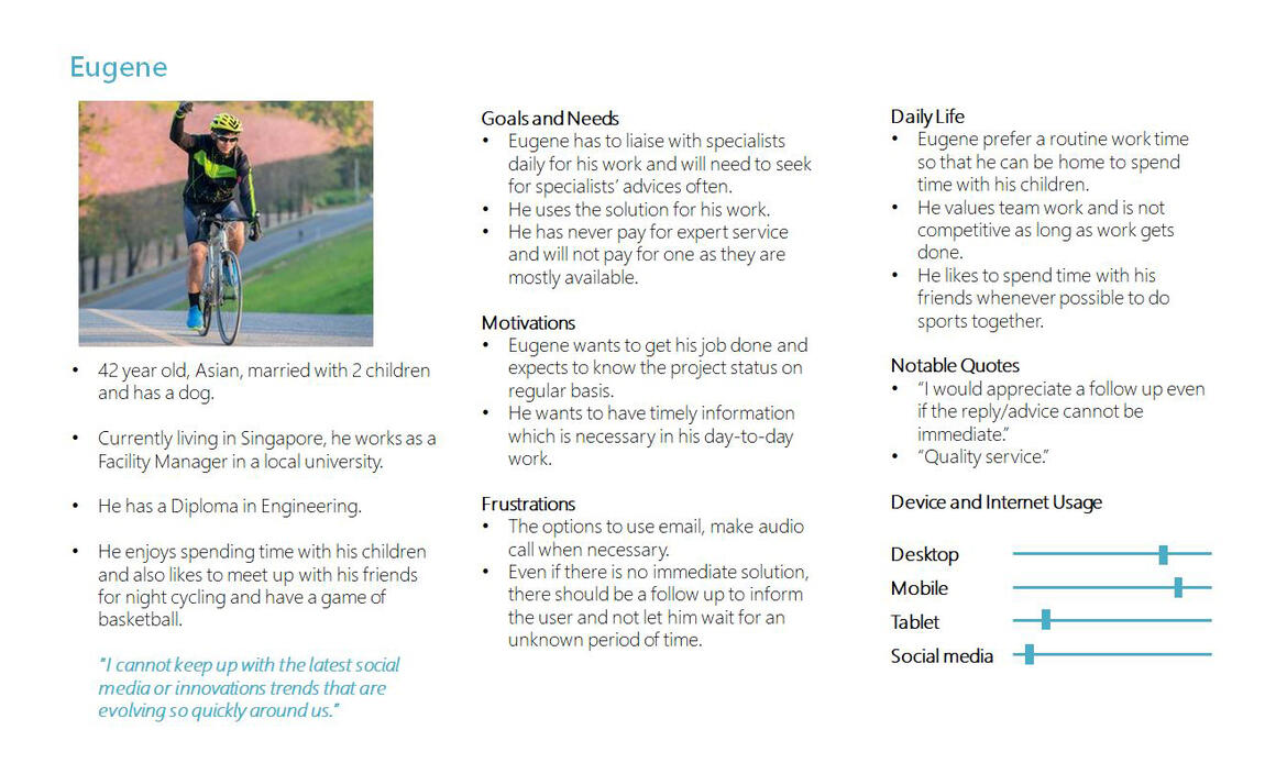
USER PERSONAS
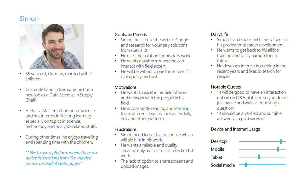
I created 3 personas based on the findings from the user research.These personas help to identify the user’s needs and goals, provide the answer for the question: “whom am I designing for?”
06
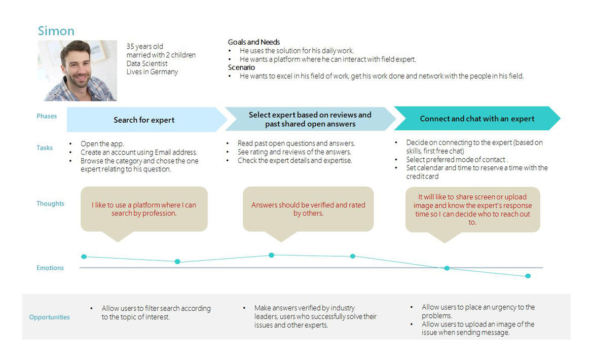
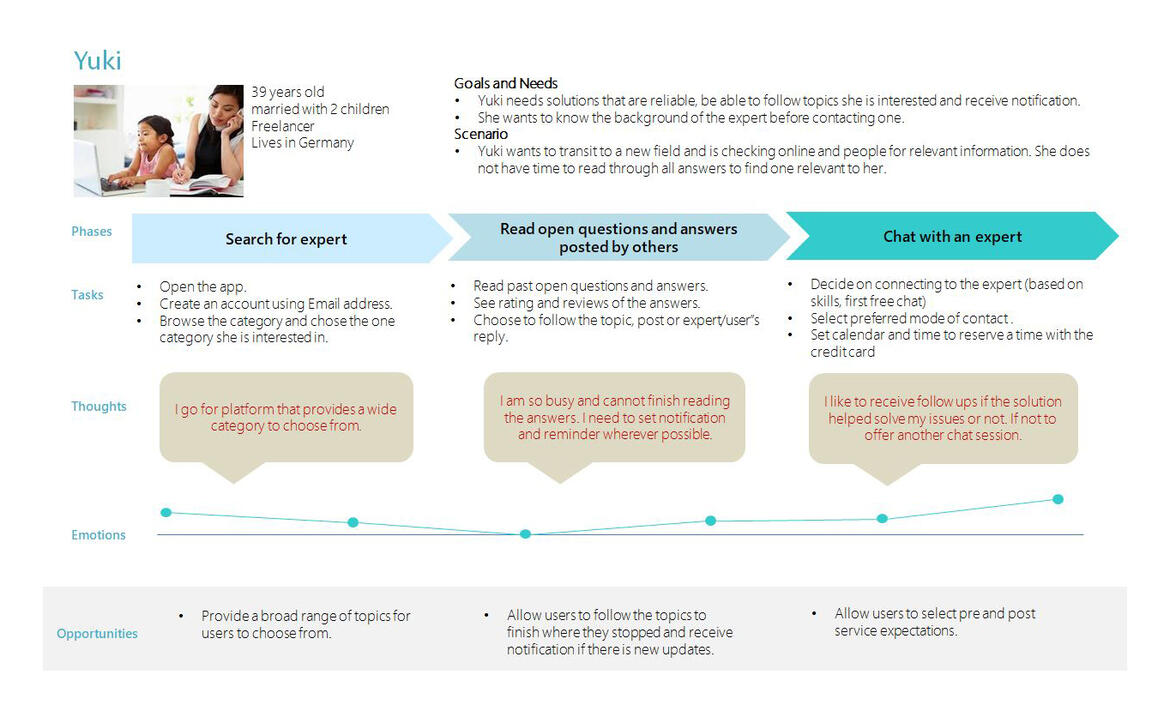
USER JOURNEYS
After creating the personas, visualising the process the users go through help me to know where the users’ needs are met and focuses on what the user needs to accomplish the goal.
07
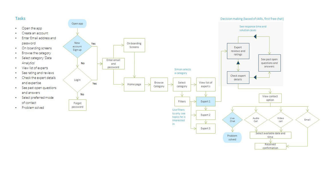
USER FLOW
The user flow helps me discover what screens a user need to interact with and how users might approach each tasks they need to complete.
08
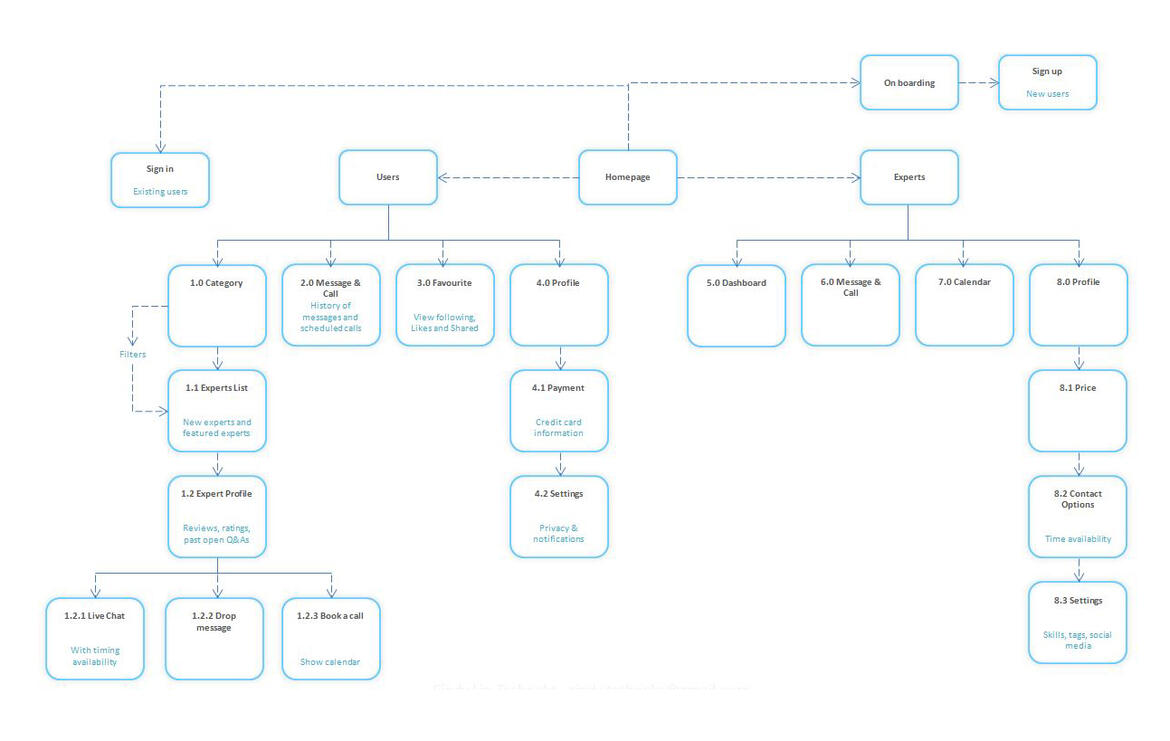
INFORMATION ARCHITECTURE
The sitemap was created to organise the information on the web app and to see how pages are connected.
09
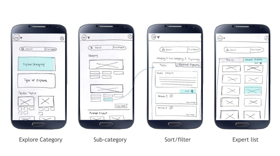
SKETCHES
By adopting a learn-while-doing approach, solution need not be perfect upfront but instead small packages of value to test out early what works and what doesn’t in a real market.
10
WIREFRAMES
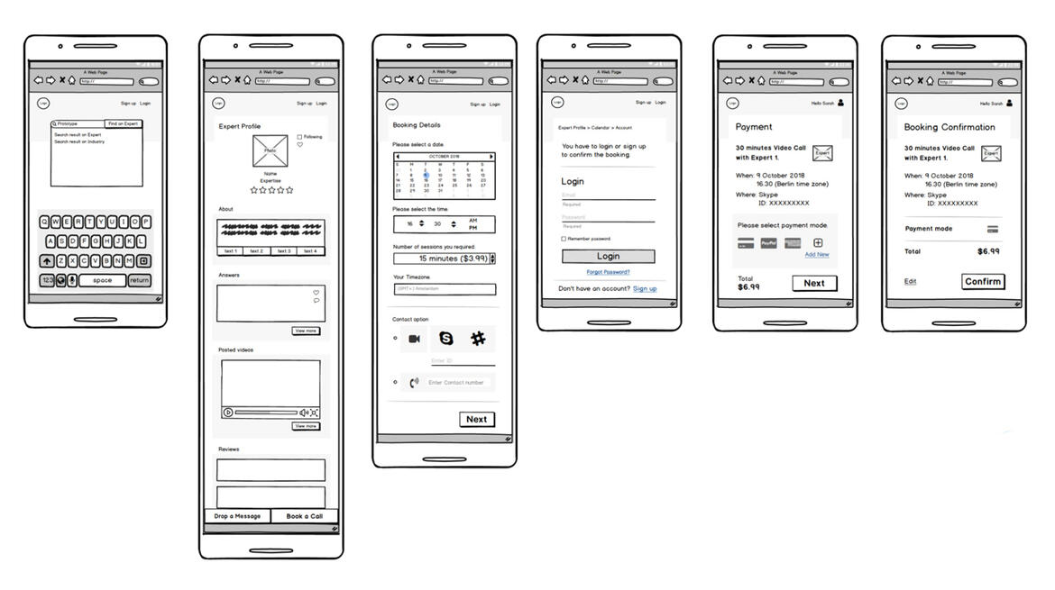
Low Fidelity Wireframes
Brings clarity to the projects with all the interactions, layout needs making it easier to communicate ideas to the team and to gather feedback at an early stage.
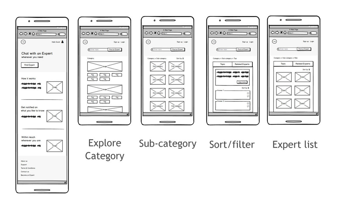
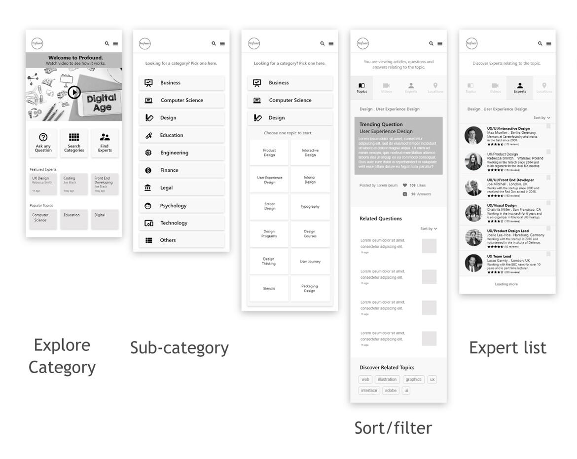
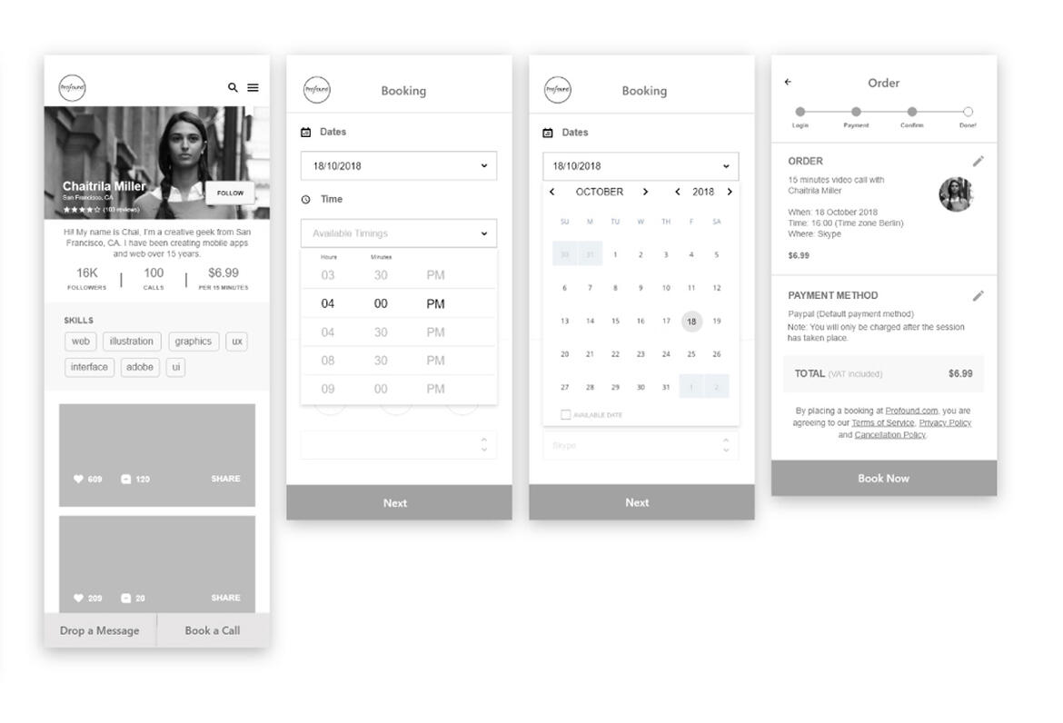
Mid Fidelity Wireframes
The design solutions from the initial phase have been further iterated. Prototype were tested with classmates and instructors to inform the design ideas. Various ways and features were added for the user to view both goals and tasks.
11
USABILITY TESTING
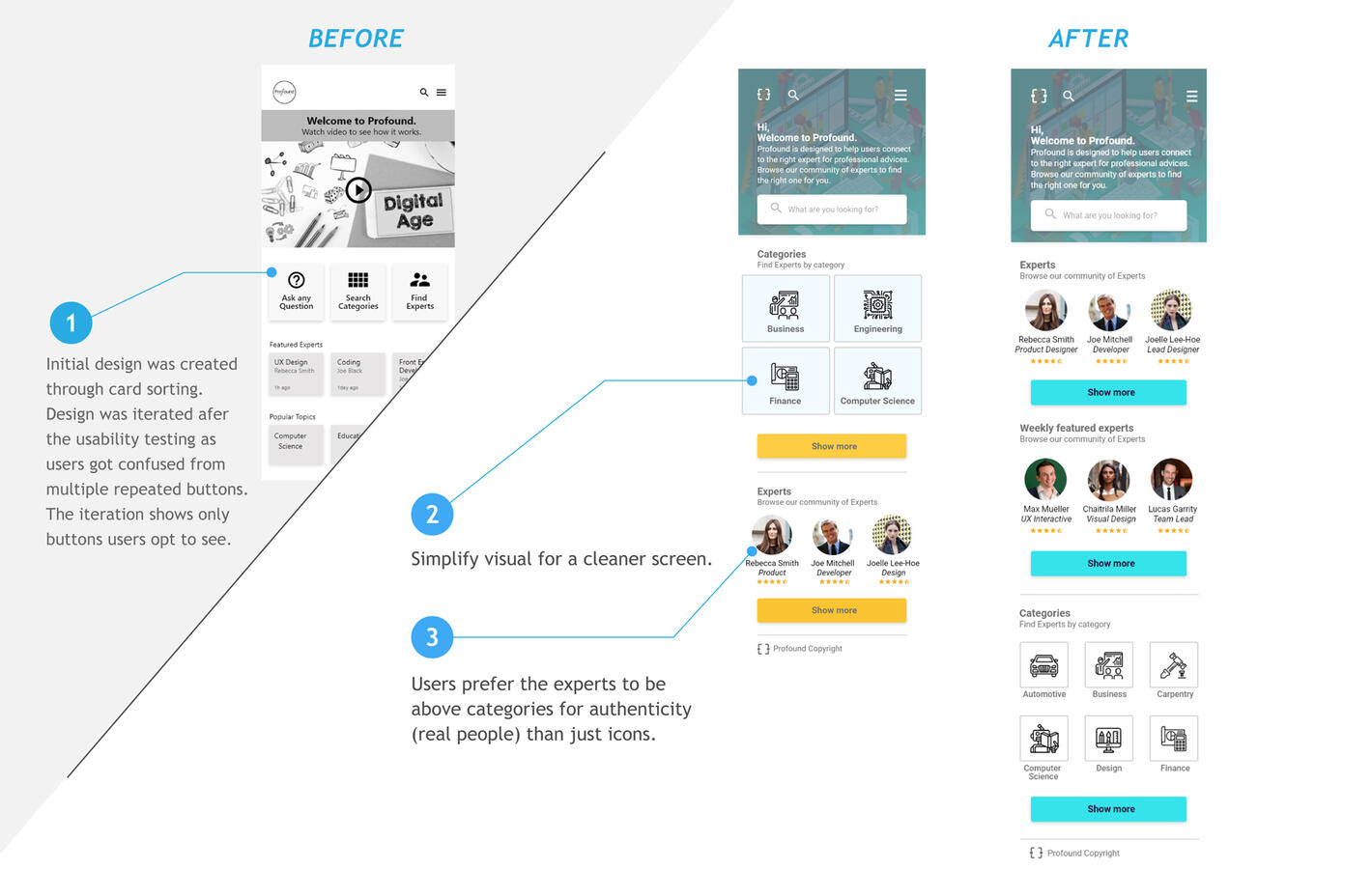
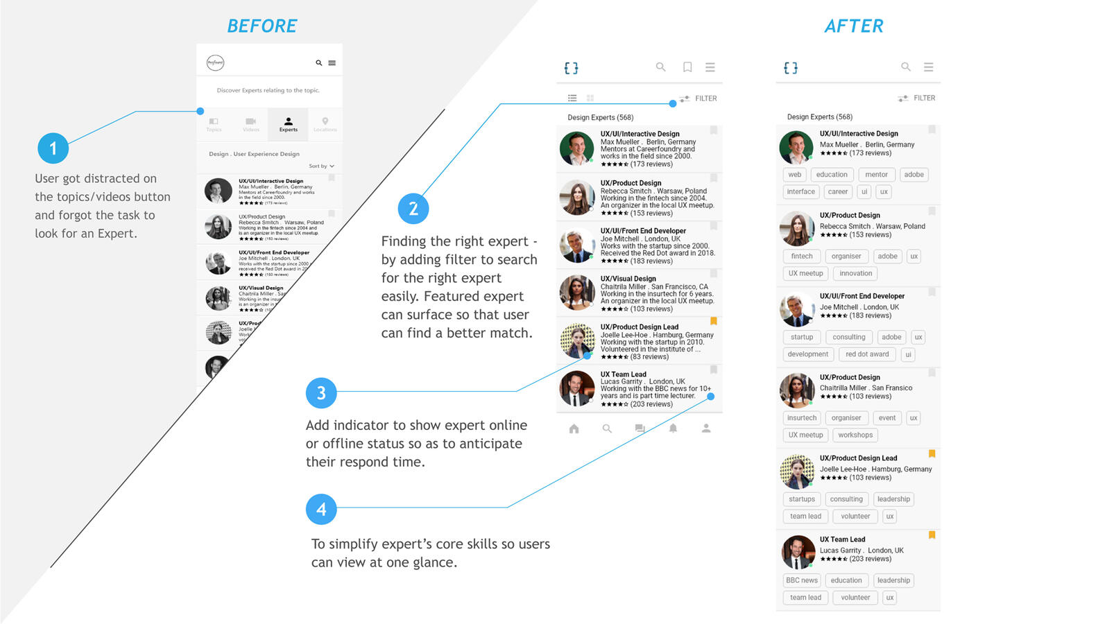
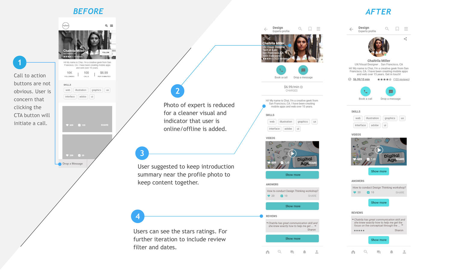
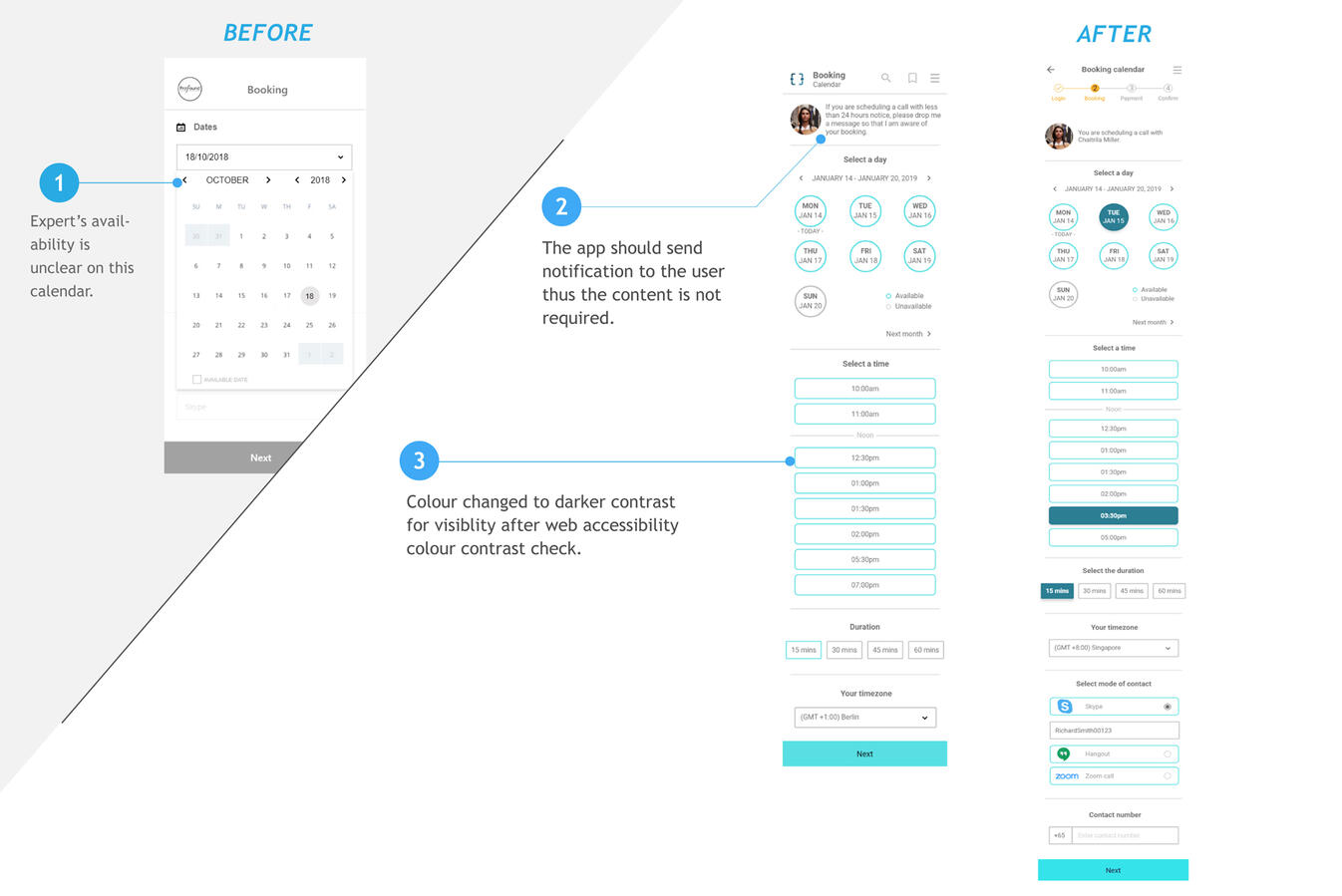
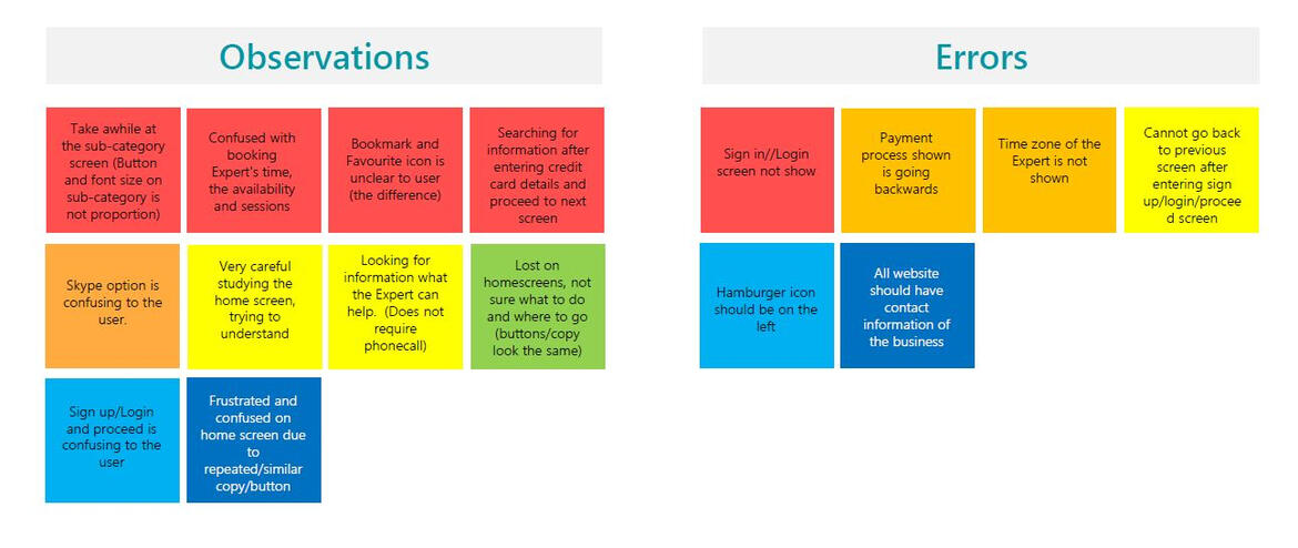
Until here, I had understood the problem and had created prototypes in various level of fidelity. To finish this stage, I created interactive prototype in Invision and was ready to test it with real people.I conducted usability tests with 6 particiapants with the objective of observing and note taking if they were able to complete specified tasks successfully. These sessions were conducted both in-person and online by me as the researcher.
Goal
The main goal of this study is to get an overall sense of the usefulness of the web app and to identify any areas of improvement as it relates to the main feature
- finding the right experts and connecting with experts
- to simplify the process to ensure that users can easily achieve their goals.
Test Objective
To determine if the participant understand what the web app is about quickly and easily (finding the expert with informed details)
- search for and select an Expert in a given category
- make a booking with an Expert
- find out if the information (icons and titles) displayed on the screen is straightforward and understandable to the audience.
- find out if participant is satisfied with the overall layout, components, images, interactions.
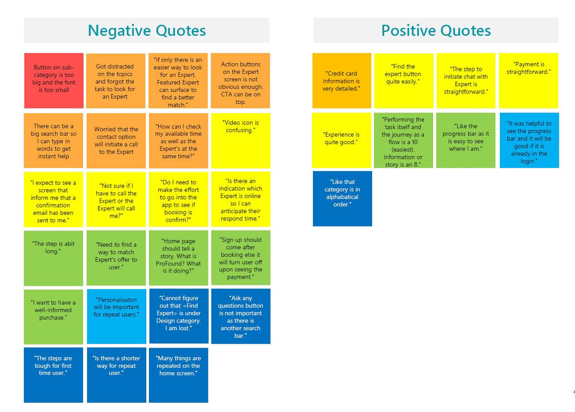
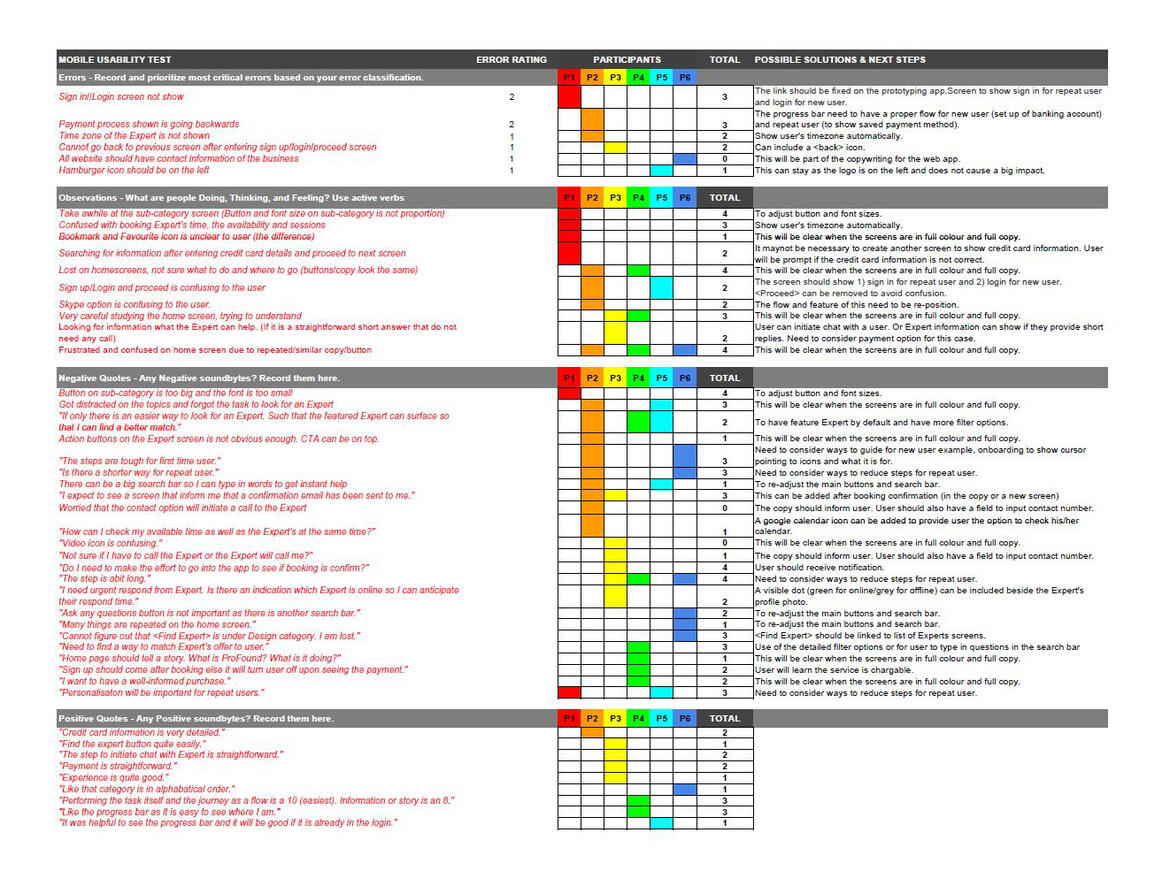
13
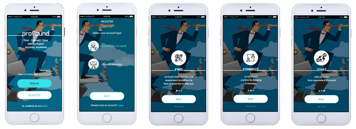
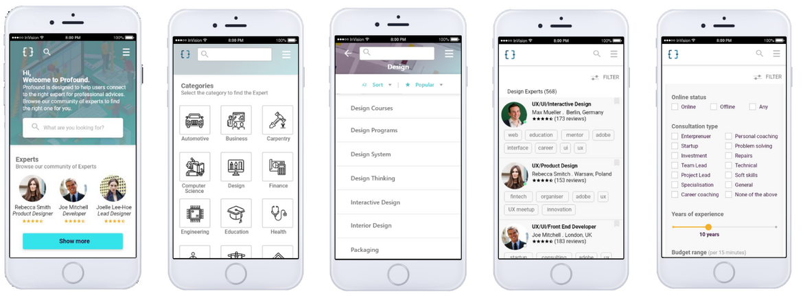
USER INTERFACE
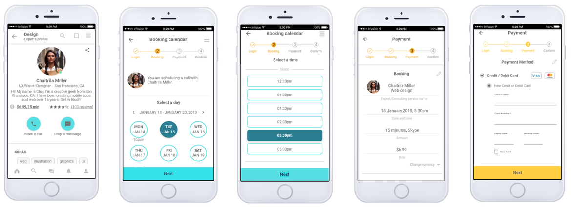
Since ProFound is a free app - having a simple scrollable screen would be optimal to outline the accessibility of the contents and features.Taking into considerations of users’ preferance for more white space, simple icons with strong contrast colour buttons will make ProFound look professional, lucid and easy accessible.
Cindy Lin-Tschoeke | UX, UI & Visual Designer | [email protected] | Last updated in 2021
